Part 5: Contextual focus point – Frank Auerbach’s portraiture

Contextual focus point: Frank Auerbach’s portraiture: 

Frank Auerbach’s approach to portraiture is legendary and through it he makes some very interesting points about the nature of portraiture and of drawing. Research what makes Frank Auerbach’s portraits unique, and how he used the passage of time in them. Think about why he might have done that and make notes about how working from life differs from working from a photograph in terms of the way we experience the time spent.  http://www.tate.org.uk/art/artists/frank-auerbach-676

Research source material:  frank auerbach

From Rembrandt, Sickert and Bomberg to Auerbach

Capturing the essence of a person visually is not an easy task. The self portraits below are all the artist’s attempt to convey, not just a flat image of themselves, but also, and more, a feeling and insight of sorts into how they perceive themselves to be, at a time, in time:

Rembrandt (1630) Self-portrait with beret, wide-eyed. [Etching]. Available at: https://www.rijksmuseum.nl/en/my/collections/2329304–alie-rouw/rembrand-van-rijn/objecten#/RP-P-OB-697,1 [Accessed: 12 January 2019].

Bomberg, D. (1932) Self-portrait. [Oil on canvas]. Tate. Available at: https://www.tate.org.uk/art/artworks/bomberg-self-portrait-t03265 [Accessed: 12 January 2019].

Auerbach’s early self portrait of 1958 displays touches of Rembrandt’s use of dark and light to capture an image that some have said “possess remnants of the heavy shadow of the war” (Second World War). It also shows his use of layering, scraping back the charcoal with an erasure, and building the final ‘acceptable’ image:

Auerbach, F. (1958) Self-portrait. [Charcoal and chalk on paper] Tate. Available at: https://www.tate.org.uk/whats-on/tate-britain/exhibition/frank-auerbach/auerbach-introduction [Accessed: 22 December 2018].

His 2014 self portrait displays firm and dominant black lines, almost in a way to portray his assertion of being – ‘this is what I am’, in a similar way as seen in both Sickert’s and Bomberg’s self portraits:

Auerbach, F. (2014) Self-portrait. [Graphite on paper] Available at: http://www.marlboroughlondon.com/artists/frank-auerbach-2/ [Accessed: 3 January 2018].

Getting to the core of the character of a sitter, self included, is something that takes time and is rarely pulled off at a single attempt. Frank Auerbach didn’t record himself as frequently as Rembrandt, Sickert or Bomberg, but he did learn from their influences on his own work.

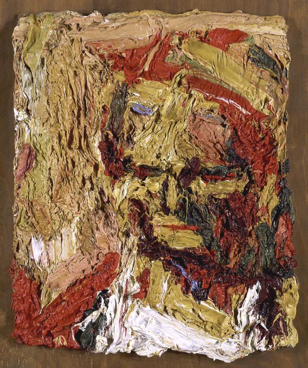
Auerbach developed a fascination, some might say an obsession, for inviting a small coterie of people to sit for his portraits, including: Estella (Stella) Olive West (“E.O.W.”); Julia Yardley Mills (“J.Y.M.”); Catherine Lampert and William Feaver.

“I find myself simply more engaged when I know the people. They get older and change; there is something touching about that, about recording something that’s getting on.” Available at: https://www.tate.org.uk/whats-on/tate-britain/exhibition/frank-auerbach/auerbach-introduction [Accessed: 3 January 2019].

Auerbach, F. (1960) Head of E.O.W. I. [Oil on board] Tate. Available at: https://www.tate.org.uk/art/artworks/auerbach-head-of-e-o-w-i-t06682 [Accessed: 2 January 2019].

Here we find a feature of Auerbach’s developing work that can also be found in his mentor Bomberg’s later style of applying heavily worked paint in an expressionistic manner: 

“Ridges and gullies, dragged paint, violent swirls across the surface. Busy in a world of restless squashy movement. Thick layers, scraped back, creating the image through working with the paint and the surface.”
(From: Phaidon Press (1994) The Art Book.,p.21.)

Hands, brushes, palette knives, putty scrapers and paint squeezed from the tube get applied to the task – hands on in spades with heavy impasto work – scraping back, layering and sculpting the essence of the person he sees before him.

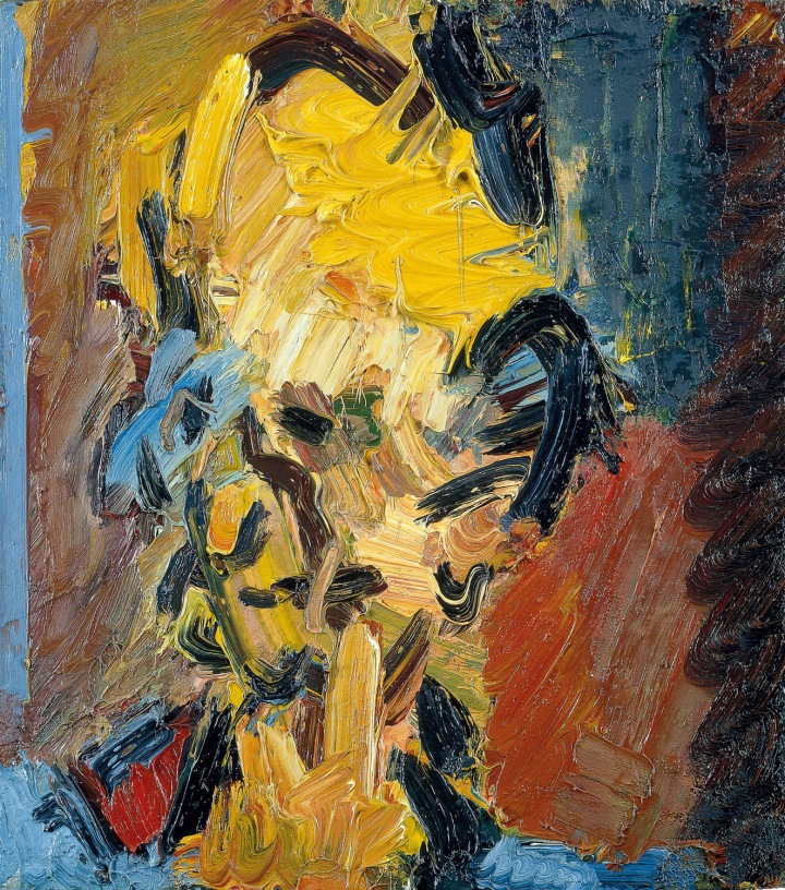
The brush mark making in Head of J.Y.M. No.1 seems to combine an impasto application to a more fluid capturing of the sitter:

Auerbach, F. (1981) Head of J.Y.M. No.1. [Oil on canvas] Tate. Available at: http://www.visual-arts-cork.com/famous-artists/frank-auerbach.htm [Accessed: 3 January 2018].

This later portrait shows a marginally less abstracted rendering in paint, but retains the daubs and smears of his impasto style in an almost monochromatic snap-shot of his sitter J.Y.M. Fluid brush strokes, almost swirling across the canvas captures a less strident portrait of his sitter, although the use of black lines still directs the image:

Auerbach, F. (1984-85) Head of J.Y.M. II. [Oil on canvas] Tate. Available at: https://www.tate.org.uk/press/press-releases/frank-auerbach-tate-britain [Accessed: 2 January 2019].

Auerbach’s later portrait of William Feaver sees a return to the use of vibrant colour in the thick impasto mark making. The scraping and layering are evident. The black lines are there and the whole visceral experience of the act of painting is clearly obvious to the viewer:

Auerbach, F. (2003) Head of William Feaver. [Oil on board]. Tate. Available at: https://www.tate.org.uk/whats-on/tate-britain/exhibition/frank-auerbach [Accessed: 3 January 2019].

Most recently we have this somewhat muddy looking tonal portrait of Catherine Lampert, still with the definitive black lines and suggestions of an image in what seems like frantic mark making:

Auerbach, F. (2017) Head of Catherine Lampert. [Oil on board] Marlborough Fine Art. Available at: http://www.artnet.com/artists/frank-auerbach/ [Accessed: 3 January 2019].

For me, what makes Auerbach’s portraits unique is the uncovering of character, personality and form of his sitters. The viewer has to work at this, in a way almost has hard as Auerbach had to work in the doing of it. The mark making is gestural and is directed at teasing out the image on the canvas.

There is an exciting energy in these portraits that pushes the traditional concept of portraiture to a level beyond what inspired and influence him in the works of Rembrandt, Sickert and Bomberg. It is almost as if Auerbach took his sitters apart in his mind as he applied paint, scraped back and re-painted, all the time seeking further into what he saw as the essence of their being.

The fact that he used the same band of happy models over many years enabled him to delve deeper into his memories of them and the triggers of seeing them sitting before him anew each time.

As a final comment, I would suggest that in viewing Auerbach’s portraits, I concur with the statements he made to film in The Last Art Film on the three areas that, for him, make a work of art. His portraits are not “immobile”, they are “engaging” to the viewer; there is “expression” and “the feeling of an idea”; and there is “tense surface character” in the mark making. His portraits are indeed “ineluctable”.

Notes taken from The Last Art Film – Auerbach, J. (2012) The last Art Film. Directed by Jake Auerbach [DVD]. UK: Jake Auerbach Films. [Accessed: 14 January 2017].

Whether or not the same energy and insightfulness would have/could have been captured in working from a photograph of his sitters is debatable. While a photograph might bring up a memory of the person or scene and the point in time when it was taken, there us no escaping the fact that addressing the subject in real time, and over time, has the potential to capture much more of the artist’s own acts of looking, thinking, changing, reflecting and doing into what becomes the completed (maybe never finished) piece of art.

Stuart Brownlee – 512319
13 January 2019

Part 5: Project 4 – Time and the viewer

Aim: Make a drawing which forces the viewer to use time differently. This may mean a drawing which takes time to make sense of, or a drawing that creates a feeling of a certain pace. The drawing may need an investment of time by the viewer in some way. A drawing is a record of the time you spent making it, but the viewer also spends time looking at it, perhaps seeking meaning, enjoying its beauty or marvelling at the artist’s skill. 

Reflection: Reflect on the time spent by the viewer and how it relates to what you do as an artist. 

Process:

Blank sheet of A3 paper, ink pens and brushes, my imagination and an initial focus (clue: the drawing of a piece of wood from a previous project):

Time and the viewer – ink on A3 paper

Reflection:

I have my own inspirations and thoughts about this ink drawing, including what the various motifs mean to me – sucking mouth and lips, Blakean figure, flying hands, bullet hole eyes, animal-like splatters, tendrils and trace lines.

What a viewer might see is unknown, but maybe they pick up on some of the mystery by spending time interpreting and beginning to form their own understanding of what they see and what they think the artist intended. Time spent by a viewer can be described as somewhere on a continuum between ‘glancing and walking on by’, ‘stopping for an instant and moving on’, ‘hesitating for a few moments and pondering’, ‘staying, engrossed, engaged and questioning’.

What does the viewer see? How does that relate to what I intended? Did I really intend anything or was I merely doodling? Does it really matter?

In the end I think two things: 1) I enjoyed making ‘art’, putting down marks and building an image; 2) if the viewer receives some enjoyment, insight or maybe even an epiphany, the image will have served some purpose (it is not necessary that I know about this for me to continue in making ‘art’).

Stuart Brownlee – 512319
11 January 2019


Part 5: Project 3 – A finer focus

Aim: Gwen Hardie is an artist who makes careful drawings and paintings of small areas of her own skin. Richard Wright is a former sign writer turned Turner Prize winner who makes intricate wall drawings. Grayson Perry is a ceramic artist who makes detailed extended doodles. Jim Shaw combines exquisite naturalistic detail with complex cartoon imagery. Do some research into artists who work in a similarly painstaking or meticulous way, something which arguably has become one of the most significant features of contemporary drawing. By making a drawing of your own which involves focused effort you’ll be in a position to reflect on how this affects your relationship with the subject and the process and what it communicates to the viewer.

Method: Choose a subject which has a substantial number of detailed parts. Think about whether these parts will be repeated (a plate of baked beans, for example) or all different (a hyper-realist drawing of pins and nails). Consider also whether the parts will be drawn from observation or invented (as in the work of Paul Noble). Remember that the original subject may not be primarily visual (in extended doodling, for example); you may be using drawing to describe a narrative or even musical score, so that the imagery is secondary to the relationships between the elements. 

On a technical note – if you’re drawing with pencil, you’ll need to sharpen a normal pencil much more frequently when working on fine detail. You may prefer to work with a harder pencil than normal. Be careful to protect areas with a sheet of paper to stop the moisture or movement from your hand smearing the graphite. If necessary, support your forearm with a cushion to lift it from the page. It’s not ‘cheating’ to use a projector or tracing paper here to create extra layers of complexity. If you decide to make a hyper-realist drawing, remember that the key to this is rendering the behaviour of cast light accurately to the smallest degree you can muster. In reality, each eyelash and pore of a face has its own little microcosm of light falling on one side and casting a shadow behind to reveal volume. Many hyper-realists use blown-up photographs of their subjects to get into the nooks and crannies that the human eye just can’t differentiate. 

Reflection: Stephen Walter is a contemporary artist who works a lot with drawing and mapping. He works in such detail that the viewer needs to use a magnifying glass to experience parts of his artwork. Look at Walter’s work, read his comments and reflect on them in your log. What does such a fine level of detail lend to the image? http://www.stephenwalter.co.uk/home.php [note: online link cannot be found].

Research:

Research on the artists proposed and a couple of others that have attracted my attention can be found here: project 3 research

My finer focus:

I have a garage full of spare parts for cars and workshop manuals for just about every car I have had the pleasure of owning and driving. From one of these manuals I pulled a page describing the intricacies of front brake disc callipers and pads. Enlarged onto A3 card, this became my ground for the drawing:

Workshop manual page – front brakes

Retrieving a single brake disc calliper and disc pads from a box in the garage, I set out an initial composition on top of the workshop manual page:

Brake disk calliper and pads

Adjusting and adding bits to the composition allowed me to then lay down my drawing in pencil:

Overdrawing of objects onto workshop manual page

I chose felt-tip pens and coloured brush pens to create the brake parts, and pencil and charcoal to draw out the spanner and pliers, with shadows. Also added some tea mug stains and thumb prints:

Day 1 – first rendering

More of the same in Day 2, expanding the disc calliper and adding more touches of actual rust:

Day 2 – second rendering

Building the brake calliper:

Day 3 – third rendering

Completed brake calliper and pad along with final shadows:

Day 4 – finished drawing

Reflection:

Not a map of a physical place or space, rather a visual reminder of the process, the tools required and the mess of deconstructing a brake calliper. The detail achieved by using ink pens and brushes suggests another dimension – a world of colourful drabness that is not always visible.

Stuart Brownlee – 512319
11 January 2019

Part 5: Project 2 – An artist’s book

Aim: Artists’ books can be anything from a concertina fold to a professionally bound volume or an old textbook with sheets stuck in. 

Research artists’ books as a form of artistic practice. Hans Peter Feldmann, Wolfgang Tillmans, Sol de Witt, Eileen Hogan and Arnaud Desjardin are just some of the artists who have worked in this way. The Chelsea School of Art has a collection of about 3,500 artists’ books established by Clive Philpott, an expert on the subject. The collection includes concrete poetry, European and American conceptual works and contemporary British artists. 

Review your research and, perhaps taking an idea from your existing sketchbook work, create an artist’s book about something which elapses over time. 

Look at the drawings which Sandro Botticelli made to illustrate Dante Alighieri’s The Divine Comedy. Dante’s journey through the three realms of the afterlife is depicted visually with breathtaking vitality and ingenuity.

Method: Your research should have opened up innumerable possible routes to completing this exercise. There are plenty of instructive tutorials on the web if you want to try something more traditional or to investigate the potential use or misuse of the craft skills of book binding: 

http://www.youtube.com/watch?v=aWHkY5jOoqM&feature=channel&list=UL  

http://www.youtube.com/watch?v=ue52htX3j0k  

http://www.youtube.com/watch?v=Mgg0lQP8Ytw&feature=channel&list=UL  

Remember, though, that an artist’s book can just be a reworked found object, or a simple fold of paper. 

Reflection: Next, reflect on yet another aspect of time as you experience what it’s like to lose yourself in the concentration required to work in a very highly focused way.

Project ideas:

As well as checking out the online videos above, I looked at the University of Kent Bookbinding Workshop videos by Tina Lyon on: https://research.kent.ac.uk/artistsbooks/how-to-make-an-artists-book/#

I also investigated the artists listed in this .pdf document: artist’s books – source material

My final decision, however, was to make use of an already found object in my possession. The research for this can be found in this .pdf document: drawing 2 part 5- project 2 – an artist’s book – project ideas

Process – preparatory work:

Having absorbed all of the research information, my decision was to forego attempting to create my own ‘new’ artist’s book using bookbinding techniques. Rather, I chose to re-purpose a found object – an old leather-bound photograph album from the late 19th century that had been in my possession for many years:

Found object for artist’s book – old photograph album

Old photograph album clasps

After removing the many family photographs from its pages, I began the process of re-working the bound volume for its new purpose of becoming my first ever Artist’s Book:

Inside boards with photographs removed

Book opened flat

The bound photograph album had 18 boards (36 pages in total) and after cleaning them up I reduced the number of pages by joining two boards together, resulting in 9 boards. Between each board is a sheet of coloured card, ready for content and I coloured the boards using Posca ink pens:

Board window surrounds coloured with posca ink pens

A view through the board windows

Coloured card inserted between boards

‘Artist’s book’ wooden name plate inserted onto front

Using an old wooden painter’s palette I marked out the letters ‘artist’s book’ in lower-case.

Honesty plant example page

Pond frond example page

Tree bark, mushroom and lichen example page

My artist’s book:

My artist’s book – front cover

I used relief outliner paste to highlight the letter and bolted the title panel onto the leather front of the album.

Inside front cover

I pasted a record of where the original album had come from in the inside of the front cover – a bookseller’s shop in the Trongate  area of central Glasgow at the turn of 19th/20th centuries. The photograph album came into my hands in the 1970’s, purchased from a street trader in Paddy’s Market just round the corner from where the album originated in the Trongate.

“Found objects from the garden”

Contents page

Ivy – page 1, recto

Ivy – page 1, verso

Wood – page 2, recto

Wood – page 2, verso

Leaves – page 3, recto

Lichen & fungi – page 3, verso

Rowan berries – page 4, recto

Rowan tree – page 4, verso

Bark, mushroom & lichen – page 5, recto

Sweet William, Feverfew & Periwinkle – page 5, verso

Pond grass – page 6, recto

Feathers & white berries – page 6, verso

Rapid spreader – page 7, recto

Holly, Acer & ground cover 1 – page 7, verso

Ground cover 2, White Lilac & Mahonia – page 8, recto

Fern – page 8, verso

Fern – page 9, recto

Honesty – page 9, verso

Yellow on the Broom – page 10, recto (additional bound-in page)

Words are like seeds – page 10, verso (additional bound-in page)

The Librarian – page 11, recto (inside rear fly-leaf)

Reflection:

This project took me around three weeks in total to get the original album prepared, to accumulate the content and then to populate the pages and complete it to my satisfaction. As a first attempt at making an artist’s book I am pleased that it turned out as I had imagined it – it has a backstory and it is also a collected memory of what my garden’s found winter objects mean to me.

Stuart Brownlee – 512319
9 January 2019

Part 5: Project 1 – A changing scene

Aim: Drawing moving figures or a changing scene can be extremely challenging. A large part of that challenge, however, is your own conception of the purpose. By taking a step back from trying to pin the action down to a static conclusion, and instead making a drawing which is a record of the movement and action itself, we can begin to reflect on how to balance movement and form to create a dynamic image.

Method: Find a fairly busy scene, with plenty of movement. Sit somewhere comfortable and out of the way and start making a drawing. As something catches your eye, capture it as best you can. Keep responding to movements as they happen so you build up a drawing full of dynamic energy. Depending on how fast you can capture form or how much repetition your view has, you may be able to build up a convincing representation of the scene. Whatever happens, you should be able to make a drawing which captures a sense of time elapsed, rather like a photographic long exposure. Don’t lose focus; make each mark as accurately as you can. Even if you just get a small mark representing the back of someone’s head before you lose them, make sure that mark is as accurately shaped and placed as you can get it.

Reflection: Review the work you’ve produced for this project and make some reflective notes in your learning log. What were the main challenges in working this way? Did you feel comfortable focusing on movement at the expense of a more ‘finished’ effect? Did you choose the right materials for the job? What would you do differently another time?

Process:

I began with some trial sketches to try and get myself used to the idea and feeling of sketching outside, on the street, in amongst people moving about. These are mainly random pickings from what came into my sight. However, sketches 3-5 are an attempt to start to try and create some kind of scene, or composition. In all I used biro-like pen, graphite pencil, pencil and brush pen:

Trial sketches, page 1

Trial sketches, page 2

Trial sketches, page 3

Trial sketches, page 4

Trial sketches, page 5

A changing scene:

Scene 1 – HB graphite pencil

People coming and going at different stages of my viewing and sketching, and apart from the golum-like image in the centre, placed on the page to create an impression of a busy street scene.

Scene 2 – 2B pencil

A more separated and disjointed capturing of people about their business. I think I got a bit scared at this point as people were casting glances my way and I hurried and moved on.

Scene 3 – brush pens

A bit more relaxed now and building a more coherent scene made from individual cameo sketches.

Scene 4 – brush pens and charcoal


Running out of steam a bit at this stage. Nonetheless, this pared-down sketch retains some semblance of perspective and sense of movement.

Reflection:

Is fear too strong a word? Out there and visible in the world of the street, uncomfortable and worried about what people might think. Please don’t approach me, as I do not want to tell you what I am doing and why. Get this over with quickly and let me get out of here.

These were my main reactions when out there. On reflection, I am pleased that I captured something of what I saw; pleased that I did manage to try out some different materials (sketchbook pages and drawing implements); and pleased that I did capture at least a sense of movement, moving on and not aiming for a ‘finished’ image.

If I want to become more confident with ‘urban sketching’ I certainly do need to push myself a lot more to open myself to the street-life experience. Living in a fairly rural environment I would need to plan ahead more as to where to sketch, materials to carry and time to allot.

Stuart Brownlee – 512319
6 January 2019